ONE DEFINING HUE
Color Watch
A closer look at this month's standout color, with styling ideas for interiors, wardrobes, and objects.
August Issue
ONE DEFINING HUE
A closer look at this month's standout color, with styling ideas for interiors, wardrobes, and objects.
August Issue
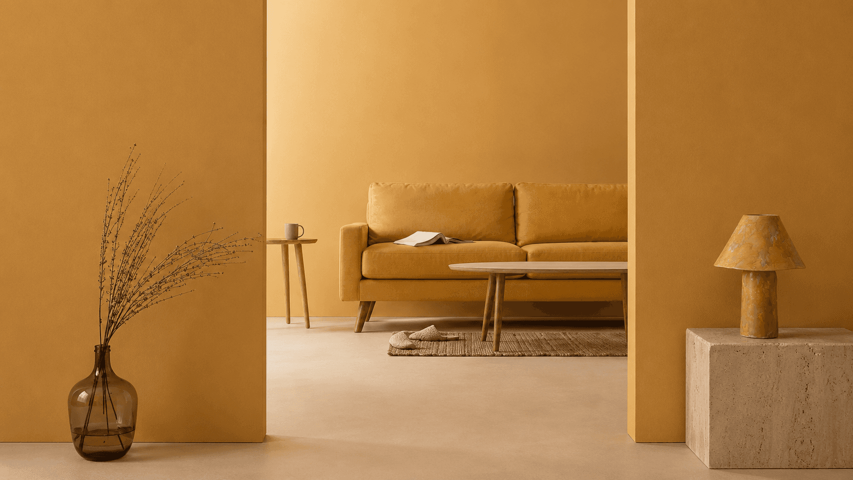
This month's color, soft ochre, marks a subtle shift in today's interiors. While butter yellow brought a sense of optimism to recent palettes, soft ochre is giving that warmth a little more depth.
Sitting somewhere between golden wheat and aged linen, soft ochre feels richer, earthier, and more enduring. Rather than drawing attention to itself, it settles naturally into a space, adding warmth without the sweetness that defined last year's pastel palette.
Designers are introducing soft ochre through sculptural ceramics, upholstery, table lamps, abstract artwork, and textured textiles. Used sparingly, it becomes a quiet focal point that warms a room without overwhelming it.
The move from butter yellow to soft ochre reflects a broader shift in today's interiors. As homeowners prioritize longevity over novelty, warm earth tones are replacing brighter statement hues in favor of palettes that feel timeless, grounded, and rooted in craftsmanship.